Tuesday, 15 March 2016

Contents Page- Explained

These images show the thought progress and major changes made to create the perfect contents page for my magazine. The first image was just a simple black background, using red and white for my fonts. I also edited the images used to create a more interesting effect. The page numbers were written in red italic fonts.This was done to attract the target audiences attention to what pages the information that interests them the most is on. This is carried out in different ways for all the different layouts and styles of my contents pages.


Here is where I changed my mind and decided to use a grey background instead of black. I also used black and white fonts instead to make it look more simple and less complicated. ' However this was almost 'too' simple, it made the page look extremely basic and I felt like there was more work to be done. I then decided to add more cover lines and change the images back to their original states. I also added the brain waves used on my front cover by my title to the contents page to suggest a theme of stability through my magazine. Although this looked quite good the background of the page was way too simple and therefore it looked a bit flat the page had no dimension too and and so I began researching for alternative options.


I wanted to have a background where the theory and ideas behind the brain waves were again represented for the contents page background. I though of an idea of using tin foil seeing as its a type of metal and could relate to the monitoring of the brain. I used tin foil that I had at home and scrunched a piece up into a ball and then carefully opened it up and laid it out. I thought it would be quite interesting and took a photo of it. Using Photoshop I then changed the colours and ended up trying it out for my contents page.


I did like the outcome however I could not read the font and cover lines properly. It looked quite messy and unprofessional.I tried to clear the background using the 'background eraser ' tool but yet again it looked unclear and still didn't make the writing easy to see for the readers.Therefore I decided to use something different.


 I came across two very nice pieces of fabric, with wonderful prints. I felt they would work and blend in well with my genre and magazine contents page.One print was thin red and white stripes and the other was slightly thicker stripes/boxes in different covers. I liked the patters and I took photos of them to later work with on Photoshop. Changing the colours on both making them black and white made a huge difference. Now they were more suitable to place as the background of my contents page.I preferred the black and white thinly striped fabric fro my background. I experimented using this and the outcome looked very professional once everything was completed. 

Once placed, I reduced the brightness to make the image darker and more sophisticated. I felt this way it was more sophisticated. Using a fabric also combined well with the genre of Indie Pop, seeing as materials are quite popular in this genre. It speaks more to the audience however the writing was once again difficult to visualize. I created white and black boxes where appropriate to help bring the information and text forward.This also helped attract information and make key news stand out even further to the reader.I also duplicated the layer with the brain waves, to make it stand out more. I felt using a stripy background helps emphasise my theory used behind the brain waves in a different manner. It shows development and how the magazine has an impact on the target audience as well as the artists involved. It gives my magazine a more hip, youthful feel and this is key for the magazine as it helps create a strong relationship between the editors etc.. and the audience.


 This is the final outcome...


Title Evaluation


To create my title and to make it perfect it did take some work on photoshop. I put this cropped alpha wave into photoshop.


I adjusted the size of the image, holding down 'shift' key  whilst the image was selected on 'free transform'. This prevents me from adjusting the pixels and squashing the image. I clicked the arrow to place the image and ensured to have a black background to see what i was doing more clearly. 


I then made a copy of what was on photoshop by 'selecting all', 'edit- copy', 'edit -paste'. This creates a new layer. I did this so i could directly edit the image. Using the 'magic wand' tool I then selected  the background of 'Layer 1' and clicked delete,to get rid of the white background and so i was just left with the red waves. I felt the lines were too harsh, i used the 'refine edge' option and smoothed out any harsh or pixelated areas. This gave me a much cleaner, neater wave.


I needed to change the colour of my wave, I wanted it to be black so it would apply to the rest of my front cover. I did this by clicking the 'color overlay' option and selecting the 'solid fill' colour as 'black'.


I wanted to make the title stand out more as it was not visible on my cover as my cover background is black too. After researching and watching some youtube tutorials I came across the option of selecting an 'outer glow'. This created an outline that was easily adjustable and not as bold. It's opacity was something I could experience with. By selecting the ' outer glow tool' I chose the colour grey to have around the black wave. This made the title more interesting, more visually appealing. The outer glow opacity and colour is something I experimented with and changed quite frequently in order to find the perfect match for my front cover. Choosing a grey 'outer glow' allowed me to then incorporate grey fonts into my front cover as well. 

This was the final outcome: I was pleased and happy with this outcome. I received the opinions of friends aswell as family whom agreed with me. 


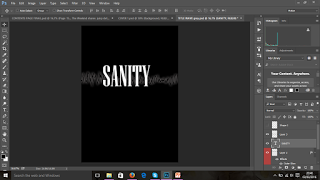
Using the text-box tool I then added text over the grey wave. I wrote down 'SANITY' using the 'Niagara Solid Regular' font and chose the font 'size 160'. I felt this was slightly small, so I then selected the 'free transform' tool and expanded the text. Again holding down the 'Shift' key to prevent the text from stretching out.This was to make sure the title stood out and captured the attention of the target audience. Also after researching other magazines within my genre of Indie Pop/ PBR&B,I realised  that the titles were usually quite large too therefore I decided to adapt this technique for my magazine too to help appeal and allow easy memorisation of the magazine and raise the chances of it being recognised by the target audience and those whom may find the magazine interesting.  


I then saved this in the 'JPEG format' and cropped the title.This was then copied out onto my front cover window. The cropped title was saved as an image and then added onto the window where I was editing my front cover. I used the 'free transform' tool once again to adjust the size of the image to fit the screen and fill in the space on my front cover. I also used the 'brush tool' in a very small size, using the colour 'black' to smudge out and rough edges around the title to help blend it in properly.


Sunday, 6 March 2016

Sanity Magazine


Font Inspiration

I used this Rolling Stone magazine front cover as the base for my magazine Sanity. I liked the layout and the style of the magazine. However I particularly focused on the fonts used and how that has an impact on the reader. I wanted to achieve the same impact with my magazines audience and therefore decided to follow a similar structure in terms of fonts used and the colours too. I felt the different fonts suggested different types of information, important names and events are written in different sizes and colours. I did this on my front cover too , it allows the reader to divert their attention to topics and subjects that interest and appeal to them the most.

Tuesday, 23 February 2016

Further Title Ideas


After researching a little more at the idea of my title I really wanted to make my title appear more interesting and unique. I did not want it to just be a simple font, I felt that it lacked something. The idea behind naming my magazine 'Sanity' was due to the fact  that the music the magazine focused on kept their fans 'Sane'. The simple fact that the lyrics behind each song has so much depth and meaning to each member of the audience. This was all quite clearly related to mental health. I researched what connected these points together and I decided to use brain wavelengths. I looked at different kinds of wavelengths and decided to use the one that appears when we are 'relaxed and reflective'.

This made sense due to the audience being in this state of mind when listening to the music of these artists. Using Photoshop i edited the wavelength colour and format slightly and experimented with the colours of the outer glow and colour of my font. I created four different varieties:


- The first example using a red outer glow worked well,however i think the wavelength was not as visible using this glow. I decided to not use this one on my magazine cover.

- The second option was changing my font colour to red as well as keeping the red outer glow which i slightly brightened. Again this did not appeal to me or people I asked as it came across as very 'horror' like therefore contrasting with my genre.

- The third option was using a grey outer glow, i liked this the most as it was still simple and also added a sense of monochrome to my magazine.This was a bit dark and not as clearly visible therefore i brightened it up a little bit ( as seen for the fourth option). I decided to use number four for my cover. I feel that it works very well with the layout of my magazine and adds a sense of edginess to it as well as it becoming more unique.