To create my title and to make it perfect it did take some
work on photoshop. I put this cropped alpha wave into photoshop.
 I adjusted the size of the image, holding down 'shift'
key whilst the image was selected on 'free transform'. This prevents me
from adjusting the pixels and squashing the image. I clicked the arrow to place
the image and ensured to have a black background to see what i was doing more
clearly.
I adjusted the size of the image, holding down 'shift'
key whilst the image was selected on 'free transform'. This prevents me
from adjusting the pixels and squashing the image. I clicked the arrow to place
the image and ensured to have a black background to see what i was doing more
clearly. 
I then made a copy of what was on photoshop by 'selecting
all', 'edit- copy', 'edit -paste'. This creates a new layer. I did this so i
could directly edit the image. Using the 'magic wand' tool I then
selected the background of 'Layer 1' and clicked delete,to get rid of the
white background and so i was just left with the red waves. I felt the lines
were too harsh, i used the 'refine edge' option and smoothed out any harsh or
pixelated areas. This gave me a much cleaner, neater wave.
 I needed to change the colour of my wave, I wanted it to be
black so it would apply to the rest of my front cover. I did this by clicking
the 'color overlay' option and selecting the 'solid fill' colour as 'black'.
I needed to change the colour of my wave, I wanted it to be
black so it would apply to the rest of my front cover. I did this by clicking
the 'color overlay' option and selecting the 'solid fill' colour as 'black'.

I wanted to make the title stand out more as it was not
visible on my cover as my cover background is black too. After researching and
watching some youtube tutorials I came across the option of selecting an 'outer
glow'. This created an outline that was easily adjustable and not as bold. It's
opacity was something I could experience with. By selecting the ' outer glow
tool' I chose the colour grey to have around the black wave. This made the
title more interesting, more visually appealing. The outer glow opacity and
colour is something I experimented with and changed quite frequently in order
to find the perfect match for my front cover. Choosing a grey 'outer glow'
allowed me to then incorporate grey fonts into my front cover as well.
This was the final outcome: I was pleased and happy with
this outcome. I received the opinions of friends aswell as family whom agreed
with me.

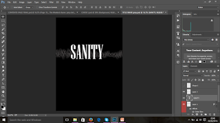 Using the text-box tool I then added text over the grey
wave. I wrote down 'SANITY' using the 'Niagara Solid Regular' font and chose
the font 'size 160'. I felt this was slightly small, so I then selected the
'free transform' tool and expanded the text. Again holding down the 'Shift' key
to prevent the text from stretching out.This was to make sure the title stood
out and captured the attention of the target audience. Also after researching
other magazines within my genre of Indie Pop/ PBR&B,I realised that
the titles were usually quite large too therefore I decided to adapt this
technique for my magazine too to help appeal and allow easy memorisation of the
magazine and raise the chances of it being recognised by the target audience
and those whom may find the magazine interesting.
Using the text-box tool I then added text over the grey
wave. I wrote down 'SANITY' using the 'Niagara Solid Regular' font and chose
the font 'size 160'. I felt this was slightly small, so I then selected the
'free transform' tool and expanded the text. Again holding down the 'Shift' key
to prevent the text from stretching out.This was to make sure the title stood
out and captured the attention of the target audience. Also after researching
other magazines within my genre of Indie Pop/ PBR&B,I realised that
the titles were usually quite large too therefore I decided to adapt this
technique for my magazine too to help appeal and allow easy memorisation of the
magazine and raise the chances of it being recognised by the target audience
and those whom may find the magazine interesting. 
I then saved this in the 'JPEG format' and cropped the
title.This was then copied out onto my front cover window. The cropped title
was saved as an image and then added onto the window where I was editing my
front cover. I used the 'free transform' tool once again to adjust the size of
the image to fit the screen and fill in the space on my front cover. I also
used the 'brush tool' in a very small size, using the colour 'black' to smudge
out and rough edges around the title to help blend it in properly.

No comments:
Post a Comment