Friday, 25 March 2016

Evaluation Question: 7

Looking back at your preliminary task, what do you feel you have learnt in the progression from it to the full magazine? 

Reviewing the production of the preliminary tasks, (this was the area that changed the most).I showed changes in the technology I used as this massively impacts the finished products. For the preliminary task I worked on PowerPoint, this really limited the creativity I could have shown for my school magazine products. The colours I used were really vivid and unappealing, it didn’t flow. It’s clear to see that there was no thought process to what colours I was using; it was all just put onto page. I used fonts and images that didn’t entirely correspond. I showed no skills as I didn’t edit the images. Another aspect that lacked professionalism was the environment of where I chose to take the images. The images were just taken within school grounds therefore again limiting how unique my preliminary task turned out to be. Also the cover lines have a lot of space in between each one, this made the page seem really basic and boring. 

Looking back at the title for my school magazine I named it ‘’Discover Hampz’’, I just created a word that I thought would appeal the most to the audience, I don’t share the same opinion looking back now. It’s quite childish and informal especially since the magazine would have been aimed at a target audience of students that are much more mature (even parents). I also feel that there was again not much thought put into the title, the font is just a plain white thick font which again lacks excitement and creativity. The contents page was extremely boring too, the photos used were basic and took up the majority of the page, and the summaries were left with a small corner of the page. This defocuses and takes away from the actual purpose behind a contents page. The preliminary task overall just looks boring and silly.

Moving onto my actual magazine production I spent more time and devoted myself to creating the perfect few pages of a magazine from a genre that I feel I can genuinely relate too. I chose to work with the Indie Pop genre due to listening to an artist (Banks in particular) nearly every day. She was the only one that calmed me down and the only artist who didn’t end up giving me a headache. I felt like I had a connection to the artist, as well as other artists within the genre and therefore could create something that would appeal to the target audience. I spent time researching, looking at interviews, taking images that could be worthy of putting in a magazine and hours on Photoshop editing, making changes , altering simple things and adding detail every time. This allowed me to create the perfect magazine, front cover, contents page and double page spread as oppose to the preliminary tasks that were created very quickly, on PowerPoint and not much thought or effort was put into it.

 Using Photoshop allowed me to create more unique designs for example the title, the different images and brushes used to have a larger impact. I adjusted the backgrounds, removed them, and adjusted the brightness and hue/saturations. I used the brush tool to colour in the backgrounds in different colours to show experimentation. I kept making vast changes to my final product such as using textured backgrounds after being told my contents page looked ‘quite flat’. There was no dimension to them at first, this changed and I created something completely different. Whereas for the preliminary task the lack of feedback held me back from making changes or seeing what needed to desperately be improved. The title I used for my magazine ‘Sanity’ shows a thought process, a huge development and has an actual idea or theory behind it as oppose to ‘Discover Hampz’.Again for my final product I kept making changes to the title too, trying different colours and fonts and choosing the final one based on feedback. 

Another massive change between the preliminary task and the final product was the language I used. I feel that for my final product I used more formal language and words that appealed to the audience more. I incorporated the lessons we had on editor’s letters and emotive & colloquial language when creating the cover lines or writing the interview. I also researched what sort of language was being used by other music magazines such as Q, NME or even Kerrang!. The language used for my preliminary front cover and contents pages was quite informal; I didn’t use any words or phrases that would attract my audience deeply.  

 From completing this task I have learned how important paying attention to detail is, how beneficial the idea of ‘trial and error’ is to the magazine industry and how much time consuming the tasks are. I also learnt how patient you have to be and that time should be spent researching in order to really understand the genre you are working in. This then aids you into completing the task with a product that has the full potential of fitting into the media industry perfectly. 
 

Evaluation Question : 6

What have you learnt about technologies from the process of constructing this product?


Example;


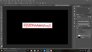
To create my title and to make it perfect it did take some work on photoshop. I put this cropped alpha wave into photoshop.


I adjusted the size of the image, holding down 'shift' key  whilst the image was selected on 'free transform'. This prevents me from adjusting the pixels and squashing the image. I clicked the arrow to place the image and ensured to have a black background to see what i was doing more clearly. 


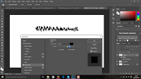
I then made a copy of what was on photoshop by 'selecting all', 'edit- copy', 'edit -paste'. This creates a new layer. I did this so i could directly edit the image. Using the 'magic wand' tool I then selected  the background of 'Layer 1' and clicked delete,to get rid of the white background and so i was just left with the red waves. I felt the lines were too harsh, i used the 'refine edge' option and smoothed out any harsh or pixelated areas. This gave me a much cleaner, neater wave.


I needed to change the colour of my wave, I wanted it to be black so it would apply to the rest of my front cover. I did this by clicking the 'color overlay' option and selecting the 'solid fill' colour as 'black'.


I wanted to make the title stand out more as it was not visible on my cover as my cover background is black too. After researching and watching some youtube tutorials I came across the option of selecting an 'outer glow'. This created an outline that was easily adjustable and not as bold. It's opacity was something I could experience with. By selecting the ' outer glow tool' I chose the colour grey to have around the black wave. This made the title more interesting, more visually appealing. The outer glow opacity and colour is something I experimented with and changed quite frequently in order to find the perfect match for my front cover. Choosing a grey 'outer glow' allowed me to then incorporate grey fonts into my front cover as well. 


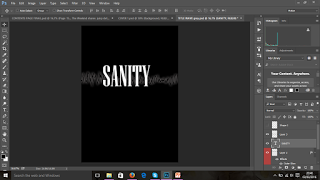
This was the final outcome: I was pleased and happy with this outcome. I received the opinions of friends as well as family whom agreed with me. 


Using the text-box tool I then added text over the grey wave. I wrote down 'SANITY' using the 'Niagara Solid Regular' font and chose the font 'size 160'. I felt this was slightly small, so I then selected the 'free transform' tool and expanded the text. Again holding down the 'Shift' key to prevent the text from stretching out.This was to make sure the title stood out and captured the attention of the target audience. Also after researching other magazines within my genre of Indie Pop/ PBR&B,I realised  that the titles were usually quite large too therefore I decided to adapt this technique for my magazine too to help appeal and allow easy memorisation of the magazine and raise the chances of it being recognised by the target audience and those whom may find the magazine interesting.  


I then saved this in the 'JPEG format' and cropped the title.This was then copied out onto my front cover window. The cropped title was saved as an image and then added onto the window where I was editing my front cover. I used the 'free transform' tool once again to adjust the size of the image to fit the screen and fill in the space on my front cover. I also used the 'brush tool' in a very small size, using the colour 'black' to smudge out and rough edges around the title to help blend it in properly.


 ade with Iphone Voice Recorder

Evaluation Questions :4&5


* Made with PowerPoint, movie maker and YouTube

Evaluation: Question 3


* Made with Prezi

Evaluation: Question 2


How does your magazine represent a particular social group? 


*Made with PowerPoint
 

Monday, 21 March 2016

Media Platforms

I decided to add the letter S at the bottom of the page onto a red square in a white font 
to make it stand out more.This also responds to Q Magazines conventions of a magazine ( Lana Del Rey double page spread article). This allows the reader to easily recognise the magazine amongst other music magazines. It also gives the magazine a chance to create a brand that can be used to create other services and media products. Using websites and social media platforms such as Twitter and Instagram allows the magazine to distribute and share information about the magazine to the audience.Using Twitter and Instagram to connect with the audience and create a relationship as well as easily notify them whenever a new issue is out, information of interviews and most recent photo shoots etc.. Allows the magazine to stay interesting and be exciting therefore attracting more readers. Having the option to also have the magazine digitally accessible targets the younger section of the audience as the younger generation are up to date with the most recent uses of technology, most people use smartphones and tablets, having the magazine available to purchase online allows the audience to access it wherever they are.

Double Page Spread: Final


Interview:


Interviewer: Hi Banks! Thank you so much for agreeing to meet with me today.
Banks: Hello! It’s a pleasure, Thank you for having me.
Interviewer: I know how busy you are so I won’t take up too much of your time.
Banks: (chuckles) Don’t worry about it.
Interviewer: I've been obsessed with your most recent single ‘Better’. I'm always listening to it. Tell us a little about the single and what made you write it.
Banks: Well, ‘Better’ is a very personal and deep, meaningful song. I wrote it reflecting on past experiences, (smiles) I've had quite a few… I wanted to connect to people but in a way that felt more reflective of who I was and not just in a way to gain publicity.
Interviewer: I see, Is it difficult for you to maintain the level of honesty in your work? It must be hard to keep a clear vision.
Banks:  I love honesty and soul and melodic beats that move you and make you breathe a little bit faster. It feels like I’ve captured every layer of who I am as a person and an artist … I’m being as honest as I can. I like my fans to see this part of me. Writing and creating music is a way for me to release and let go of all my baggage, I pour my heart out.
Interviewer: Is that the reason behind you working on your own and not collaborating with other artists as much?
Banks: I feel like when I try to talk to people about it they just don't get it (she shrugs) they don’t share the same views , so I tend to keep to myself and share them with my fans instead. Also I'm just quite shy I find it difficult to approach people.
Interviewer: How else would you describe yourself as well as the music you produce?
Banks: I’m a very passionate person, I'm also quite sensitive I tend to wear my heart on my sleeve. I try to keep up a guard when speaking to people and can come across as quite aloof which I've heard is frustrating (she grins) seeing as my music is so deep and intimate.
Interviewer: Music is not the only talent you share, You also draw quite a lot, are you working on a project for art too?
Banks: no-no, not at all, I draw during my free time, I find it’s a good way of releasing stress and a good way to escape reality during my bad days. But music is my main focus, art is just a hobby.
Interviewer:  ah how interesting, There are so many people trying to make it in the music industry today. What advice would you give to an upcoming artist dreaming to make it big?
Banks: hmm, it is a really hard process, I wouldn’t even say I've made it too far up in the industry yet myself. I would say patience is key and make sure you remain true to yourself,. Don't hide yourself and most importantly don’t let fame or money sway your beliefs. That’s the best way to make it into people’s hearts.

Double Page Spread Development

For my double page spread I decided to incorporate the same texture and idea that was used on my contents page, for my double page spread too. I wanted the two pages to flow well and not be too different, I didn't want the pages to clash. My magazine has a continuous reference to the same colours; grey, black,red and white. This is shown throughout all pages of my magazine that I created. Using the image of the black and white fabric that I took and edited on Photoshop, I expanded the image to fit nicely onto one side of the page. This would be a very great template for my interview to be placed onto.


After adding this image onto the page I used the original photo,once edited into black and white and cropped it slightly so the subject of the image attracted more focus. I placed the image on the left hand side as it is the first thing the reader will see when they open up the page, attracting attention as they will be more interested to know what is being said about their idol. The striped background is placed on the right as a base for the interview.


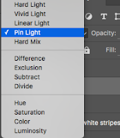
This what the page looked like after adding the lights to the left hand side of the page by the image. I decided to place the lights just above the subjects head, adjusting the opacity and selecting the 'pin light' option this made the lights fade into the background and doesn't retract attention from the image itself. I decided to add another set of the lights onto the next page too. I wanted to continue to create a 'flow' with the lights too as well as my magazine theme.


A few of the lights were placed onto the subjects head and therefore looked a bit obvious and unprofessional. I used the patch tool to remove some of these unwanted lights by selecting the area and replacing it with hair or the background etc. The ending result was really satisfying and I was pleased with the results. 


After perfecting the base of my double page spread I then added the text (the interview) onto the page. I made the text fairly small to fit onto the page and placed them. The text was difficult to see at first however after placing two white boxes underneath the text, it became much easier to see.I decided to use arial narrow font in black for the interview to make it clear to see on the page and easy to read. After this I added cover lines, information about the magazine and other extra details onto the double page spread to complete it.