For my double page spread I decided to incorporate the same
texture and idea that was used on my contents page, for my double page spread
too. I wanted the two pages to flow well and not be too different, I didn't
want the pages to clash. My magazine has a continuous reference to the same
colours; grey, black,red and white. This is shown throughout all pages of my
magazine that I created. Using the image of the black and white fabric that I
took and edited on Photoshop, I expanded the image to fit nicely onto one side
of the page. This would be a very great template for my interview to be placed
onto.
After adding this image onto the page I used the original
photo,once edited into black and white and cropped it slightly so the
subject of the image attracted more focus. I placed the image on the left hand
side as it is the first thing the reader will see when they open up the page,
attracting attention as they will be more interested to know what is being said
about their idol. The striped background is placed on the right as a base for
the interview.

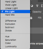
 This what the page looked like after adding the lights to
the left hand side of the page by the image. I decided to place the lights just
above the subjects head, adjusting the opacity and selecting the 'pin light'
option this made the lights fade into the background and doesn't retract
attention from the image itself. I decided to add another set of the lights
onto the next page too. I wanted to continue to create a 'flow' with the lights
too as well as my magazine theme.
A few of the lights were placed onto the subjects head and
therefore looked a bit obvious and unprofessional. I used the patch tool to
remove some of these unwanted lights by selecting the area and replacing it
with hair or the background etc. The ending result was really satisfying and I
was pleased with the results.
After perfecting the base of my double page spread I then added the text (the interview) onto the page. I made the text fairly small to fit onto the page and placed them. The text was difficult to see at first however after placing two white boxes underneath the text, it became much easier to see.I decided to use arial narrow font in black for the interview to make it clear to see on the page and easy to read. After this I added cover lines, information about the magazine and other extra details onto the double page spread to complete it.


No comments:
Post a Comment